Compton Acres and The Italian Villa
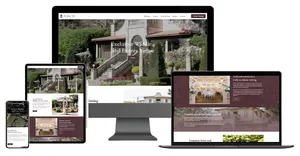
Compton Acres is one of the South Coast's most celebrated gardens, ten acres of themed grounds above Poole Harbour that have been delighting visitors for over a century, with The Italian Villa, a luxury wedding and events venue, at its heart. We gave the whole estate one identity, two beautiful new websites, and a brand built to work everywhere from a favicon to a carved stone gate.
Poole, Dorset Brand identity | Website design and build | Envelope
1920
the year the gardens were laid out
2
beautiful new websites, one shared identity
The situation
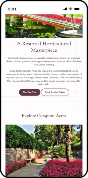
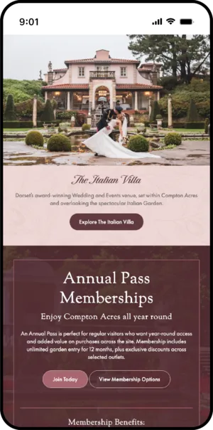
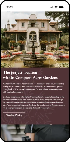
Compton Acres is the kind of place people fall in love with. Ten acres of gardens above Poole Harbour, laid out in 1920 and lovingly restored over the past twenty years into one of the finest privately owned gardens in the country. Visitors wander from the Italian Garden to the Japanese Garden by way of a wooded valley, then stay for the café, the plant centre and the shops. Thousands hold annual passes. And tucked inside the grounds is The Italian Villa, a genuinely stunning wedding venue where couples marry surrounded by a century-old garden.
A hundred years of growth is a wonderful thing for an estate and a complicated thing for a brand. The business had expanded piece by piece, each new sign and logo commissioned as it was needed, and over the decades the estate's identity had gently drifted apart. By the time we met them, four different logos were in circulation and the signage across the grounds had become a patchwork of eras and styles. To their enormous credit, the team knew it, and they arrived better prepared than almost any client we've worked with. Their marketing manager had already walked the entire estate with a camera, photographing every sign and cataloguing every logo, so the brief landed on our desk with the whole problem documented. That kind of clear-eyed honesty about your own brand is rare, and it made everything that followed better.
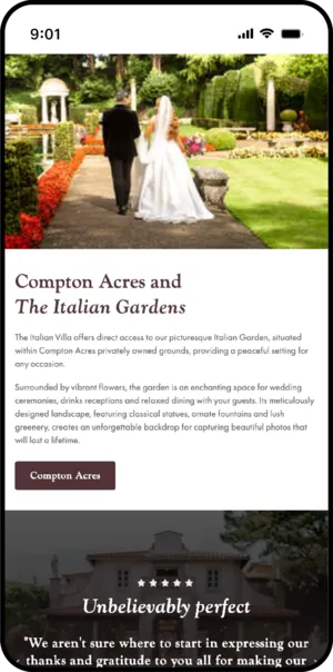
The websites told the same story of organic growth. The Villa alone had two, and neither did justice to a venue of its quality. So the project became three jobs in one: a unified identity for the estate, and a new website each for Compton Acres and The Italian Villa, all speaking the same visual language.
What had to be true
Three questions shaped the work before any design began. What do these two businesses genuinely share that a visitor could actually point at? How do you rebrand something when part of the identity is literally carved in stone? And where does a wedding enquiry really come from, given that a garden ticket costs ten pounds and a wedding costs thousands?
The decisions
One mark, because it stands in both gardens
The estate's marketing manager spotted the answer to the first question herself, and it was inspired: the Roman Temple. It sits within the Italian Garden, so it belongs to Compton Acres and lives inside the Villa's world at the same time. One landmark both businesses can claim without either borrowing from the other.
The existing versions of the mark had grown cluttered over the years, so Larcs rebuilt it from the ground up while keeping its soul, refining the statue at its centre rather than losing her. The plinth was redrawn, the figure brought back into proportion, and the bowl she holds now perches on her hand with daylight underneath it. That last detail matters more than it sounds: it's what keeps the mark crisp whether it's a favicon in a browser tab or a sign at the estate entrance. The same drawing now works at 32 pixels and at four feet, which is exactly what an estate this varied needs from its identity.
The script was already carved into the wall
Above The Italian Villa's entrance arch, the venue's name is engraved into the stonework in a flowing script. You can't redraw a building, and honestly, why would you want to? It's a gorgeous piece of the venue's character.
So the identity worked backwards from the architecture. The script stayed true to the carving, and everything around it was rebuilt: "AT COMPTON ACRES" now sits beneath it in the estate's own lettering, in a rich merlot with dusky pink alongside, drawn from the Villa itself. The typography now says what was always true, that the Villa is the jewel in the estate's crown, and the whole family of marks feels like it belongs to one place.
Book a Viewing, front and centre
The most valuable spot on any website is the top right of the navigation, because that's where every eye goes first. On the Villa's old site, that spot went to a photo gallery, which is lovely to browse but leaves an engaged couple with nowhere to go next.
For a venue where a single booking is worth thousands, that slot had to earn its keep. Book a Viewing now sits there, styled to be unmissable, and the photography moved into the pages where couples are actually weighing up their day. The venue photographs beautifully, so the images work harder now that they sit beside the ceremony details, the catering, the accommodation, right where the decision gets made.
Ticketing we can actually see
Garden tickets sell through a specialist third-party system, which is the right tool for an attraction of this size but has one drawback: the moment a visitor clicks through to it, they vanish from view. So every ticket link on the new site routes through a page the estate owns before handing over. One extra click, and in exchange Compton Acres can see exactly how many people reached the point of buying, which pages sent them there, and what's working. We run the same approach for other attractions we look after, because a business this size deserves better than guessing.
What’s live now?
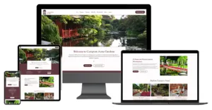
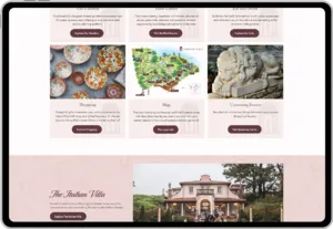
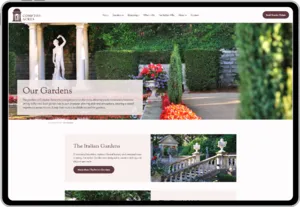
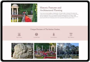
Two beautiful websites on Envelope, sharing one identity: comptonacres.co.uk for the gardens, and theitalianvilla.co.uk for the venue, where both of the Villa's old sites now land.
A complete brand system in black, merlot and pink, drawn for print and screen alike and supplied in every format a sign maker or a web browser could ask for. Lockups, icons, social marks, the lot. It's a brand built for an estate that lives as much in carved stone and roadside signage as it does on screens.
The new ticketing and membership system, wired in and measurable. And an estate team who add their own events, captions and image credits without ever needing to call us, because a good website should belong to its owners.
Best of all, the brand has escaped the screen. The brief opened with photographs of tired signage, and a few months after launch the estate's owner was on the phone asking which font the new signs should be set in and which RAL colour matches the merlot. When a client starts specifying paint codes from your brand guidelines, the identity has landed.