Challenger Experiences
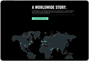
Challenger Experiences design and build immersive, story-led experiences for some of the world's biggest brands, with work delivered everywhere from London to Dubai, Doha, New York and Singapore. They invented a category, and we built them a website for a category that Google hasn't heard of yet.
Reigate, Surrey Website redesign | Information architecture | SEO | Google Ads | Content | Envelope
Global
delivery from London to Dubai, New York and Singapore
500+
search terms ruled out to find their true audience
The situation
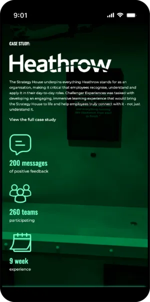
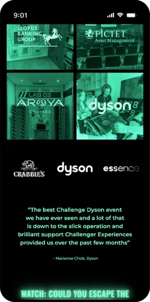
Some of the biggest brands in the world call Challenger Experiences when they want an audience to feel something. Toyota, Samsung, EY, Lloyds, PwC, Dyson: the client list is a who's who, and the work is extraordinary. Immersive training environments for Heathrow staff. A fully immersive environment for the PwC Academy in the Middle East. Escape rooms with a brand's own story built into every puzzle and prop. Conference experiences that replace the deck nobody remembers with a challenge nobody forgets. It all gets designed and fabricated under one roof in Surrey, then delivered anywhere on earth, from Dubai and Doha to New York and Singapore.
They even have products of their own. UNPACK puts a customisable tabletop escape room in a box, and The Chamber is a bespoke 40ft immersive unit that can be bought or hired and deployed wherever a brand needs a world building.
Here's the fascinating thing about being that good at something that new: the category doesn't have a name yet. The people who would love this work are searching in a dozen different directions, using a dozen different phrases, none of which quite captures it. Everyone who experiences Challenger's work gets it instantly. The challenge is reaching the thousands who haven't yet, through a search engine that has no word for what they'd be looking for.
That's the brief we love most: a brilliant company, ahead of its market, needing the digital side to catch the world up.
What had to be true
Three questions before any design. When the category has no name, how does anyone find you? How do you organise work that's the same craft applied for completely different reasons? And what do you show someone in three seconds, when the product is an experience that can't happen on a screen?
The decisions
Show them a mirror, or solve their problem
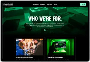
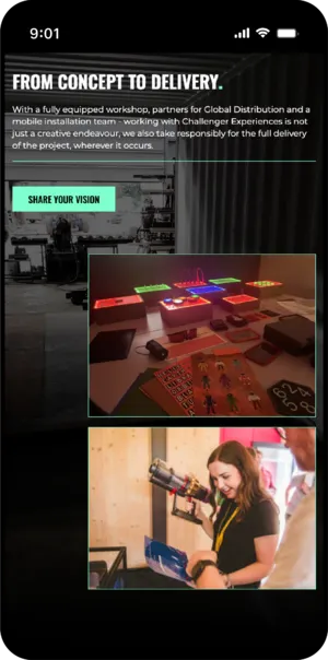
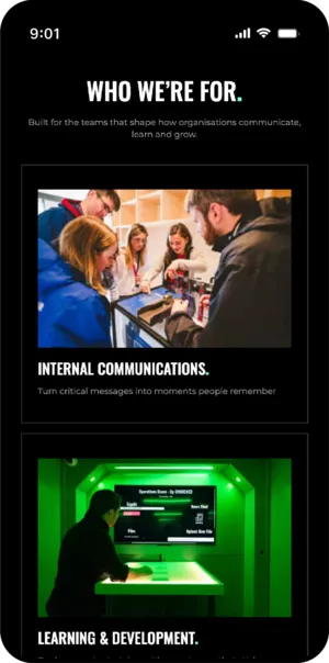
The new homepage does two things after the hero, and only two. One block shows visitors themselves: you're a conference organiser, you're in learning and development, you run a brand. The other shows them the thing they came to fix. Someone landing on a site like this knows either who they are or what they need, and almost never both, so the design offers both doors and lets them choose.
The hero above it is deliberately not a showreel, because showreels are for people who already understand. It's immersive and slightly awe-inspiring, built to make a visitor lean in before a single word has explained anything. Explanations come later. They always come later. The mistake most sites in a young category make is trying to explain on the way past, and this design refuses to.
Case studies that file both ways
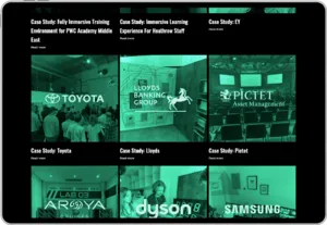
A brand experience for Toyota and an immersive training environment for Heathrow are the same craft applied for entirely different reasons, and the people searching for each will never search for the other. So the case study library files along two axes at once, by sector and by solution, and every visitor finds their own reflection. The conference organiser sees conferences. The L&D lead sees learning. Each one concludes Challenger has done exactly their thing before, which is true, and which a single-axis site would have hidden.
Naming the category with the searcher's words
When you're inventing a category, the vocabulary is a moving target, and the language that feels right from inside the business is rarely what an outsider types into Google. So a running discipline across the whole engagement, on the site and in the ads, has been ruthlessly favouring the searcher's words over the industry's. Pages, campaigns and copy are all built around the phrases real buyers actually use, tested and refined as the search data comes in.
The other half of that discipline is subtraction. In a category without a name, the words that match your work also match hundreds of things that aren't your work, so over five hundred search terms have been individually found and ruled out of the advertising. Every one sharpens the account's aim. It's unglamorous, painstaking, and precisely the work that separates advertising that finds a new market from advertising that funds Google.
Pages built for the three-second visitor
A visitor arriving from an ad is not the same as a visitor exploring a site, and pages that serve one usually fail the other. So the paid campaigns land on pages built for that exact moment: the call to action at the top, proof close behind it, a form on the page itself. Purpose-built landing pages for a purpose-built audience, refined as the campaigns learn.
What’s live now?
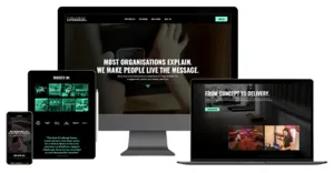
A website with the confidence of the work it represents, organised around the two ways people actually arrive: knowing who they are, or knowing what they need.
A case study library where Toyota, Samsung, Heathrow and PwC each appear exactly where their next equivalent will look.
Dedicated landing pages for the paid traffic, an ad account that knows five hundred things it isn't, and content that teaches the market the category one story at a time.
And a homepage that resists the urge to explain, because the work is the explanation.