10 Things We've Learnt in 10 Years
Ten years is a long time.
In the world of technology, however, it can seem like a lifetime.

Our 10th Birthday
What We've Learnt
Since Sonder started we’ve seen trends come and go, some more fiendishly calculated than others - from traffic driving to e-commerce suicide.
Importantly, though, we’ve also been there at the birth of a multitude of new companies - which, given the right advice and expertise, have taken off into successful online retailers.
We’d like to share 10 of the most important things that we have learnt as a company in the last 10 years. We hope you’ll find them helpful.
Design
Once upon a time the design of your website was all about flashing imagery and looking good for one size of screen. Even ten years ago, there was no mobile first design. Website designers were planning for desktops with little consideration for the tiny screen we all now interact with daily.
Web design more recently is going back to minimalism. The current conventions are actually becoming quite uniform. A clean white space and ‘boxy’ look is extremely popular due to its responsiveness across devices and ease for the customers in understanding your website sections and categories.
There is no timeless design when it comes to the internet, so no matter how beautiful and functional your website is today, it won't last forever. Having a website which keeps up with the times can make or break an online business.
Mobile
Following on from design, our needs have changed dramatically in the last decade. According to the figures surrounding mobile traffic versus desktop traffic in 2020, over half of internet traffic comes from mobile devices—with a shade over 46% coming from desktop and laptops, and 3% from tablets. Indeed, people are using a variety of devices to access your website, so the site needs to respond to the screen size and the way in which people interact on those devices.
A key difference between desktop and mobile is the mouse or trackpad versus a touchscreen—it’s a completely different tool to use the device. Simple things like hover buttons on a mobile phone can interrupt the customer journey and cost you conversions.

Speed
As our devices get smarter and slicker, your customers expect things faster. Pages need to load instantly, buttons need to be in an obvious position so people can get where they want as fast as possible.
Way back in 2010, people would wait for your page to load and hunt down your buy now button. These days, they can easily buy from another online store where the experience is easier for them.
The main thing we’ve learnt in the last 10 years with regard to speed is that you don’t have to outrun the lion, you just have to outrun the other guy. Put simply: the faster the experience on your website is, the less obstacles between the customer and a purchase. Your site doesn’t need to be the fastest in all of cyberspace to improve customer experience—you just need to make sure your site is performing better than that of your competitors.
The race for ultimate speed is, for most markets, frivolous. The fastest loading page would have nothing on it, and that’s no use to anyone.
Traffic and Conversions
When Sonder started as Open Door Internet ten years ago SEO (Search Engine Optimisation) as we know it today was in its early stages. Black hat tactics were starting to be penalised by Google and getting traffic to your website was all that most web companies ever worried about.
CRO (Conversion Rate Optimisation) is SEO’s younger sibling, where we now consider the way a customer navigates around your website and focus on making the process of completing their purchase as seamless as possible. The big change in thinking over the last 10 years is a move from being driven by numbers, like the volume of traffic, to considering the individual customers' process of purchase.
Customer Journeys
Taking that even wider than just their experience on your website, understanding the full customer journey is more of a shift than ever. All the different touch points—social media, website, desktop then mobile, review sites. Marrying that up with offline touch points is a unique challenge, particularly for small businesses who need to prove the value of each in order to justify any investment.
Technology
The concept of ‘a lot of data’ has grown exponentially. 1GB used to be a lot of data, now 1TB is a lot of data. That changes the way we need to think about backups and bandwidth quite significantly.
Virtual machines running on clusters of hardware (which most people just think of as ‘the cloud’) have made it a lot easier to plan for rapid growth of server capacity if needed.
As technology moves on, you have more options with your website. It can have more imagery and videos now that will hardly affect your load time compared to a decade ago. We’re hoping GIFs won’t be such a speed suck some day soon!
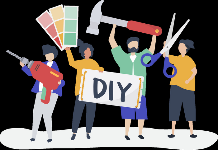
DIY
The emergence of DIY platforms like Squarespace, Wix and Shopify have levelled the playing field and helped businesses take control of launching their own sites. In the UK alone, there are over 120,000 live Squarespace websites—with 2.3 million globally.
The easier it becomes to manage a basic site and the more tech savvy the average business owner is are both changing over time.
We’re seeing business owners much more likely to use simple software with little to no training and companies are designing platforms which specifically cater to their relatively simple website needs.
They have come to expect that level of ease and control—so a good CMS is more important than ever. Our CMS offers both the ease to update your own website, should you wish to, and the complexity of platform for the website to do anything that you need it to do, including support from real, local humans whenever you need it.
Internet Connections
According to a 2020 report, 96 percent of households in the United Kingdom have internet access at home—with 400,000 of them now getting their hands on full fibre broadband. Dial the clock back to 2010, where only 73% of households had internet of any description, it’s clear the ubiquity of high-speed internet is all-embracing and here to stay.
With the rapid advancement of broadband, comes the increase in multimedia—and a website’s ability to host it without causing problems. All-singing, all-dancing sites are much more accessible now—videos, high-resolution images, animation. Gone are the days where a simple Flash display would crash a website, now anything is possible with a solid enough broadband connection.
Demographics
Demographics online are constantly shifting so you can’t ever take anything for granted. The audience on Facebook has changed significantly over the last 10 years or so. The percentage of users aged between 18-24 was at 24% in 2012—now that demographic is at just 16%. The best represented age group using Facebook in the UK is aged between 25 to 34 years old, accounting for 11.2 million of its total users.
For Sonder, this means we have to be flexible and adaptable when it comes to marketing our websites. Understanding the audience and social media trends is a vital part of the job—where one campaign might have been perfectly suited for Facebook back in 2010, might now gain better traction on Instagram.
Privacy
People used to be overly paranoid about sharing their information online, now they’re probably not paranoid enough. That’s changed the way we need to think about security, as well as shifting our concept of how much information we can ask people for.
Perhaps we are witnessing a change in the wind when it comes to people and businesses thinking about their online security. In a recent 1,000-person survey conducted by Wombat Security, a surprisingly high 44 per of UK residents claimed to be using some form of VPN (virtual private network) in a personal or corporate environment. That same survey found that a staggering 65% of 1,000 Americans asked were using the privacy software.
Coding
The underlying concepts are exactly the same today as they were 10 years ago. PHP has advanced in versions, Javascript has become nicer to work with, but fundamentally they’re the same concepts. I suppose the big change with PHP is that it’s become more “Object Orientated” and reliant on “Frameworks”.
We choose to constantly update our CMS platform 'Envelope' so that the user experience across all Sonder websites are as seamless as possible, but over the last ten years there has been no update which would stop a website from working all together should it be left unattended. That's why you can still see websites with designs from yesteryear.

The next 10 years...
So where will we be in another 10 years?
Technology evolves at such a rate that it’s difficult to predict exactly what Sonder will look like in a decade’s time. As smartphones become smarter, artificial intelligence creeps ever increasingly into our lives, and customer demands change, we know that our work practices will have to adapt and change along with it—just as we have transformed as website strategists in the previous ten years.
However the world of technology transforms over the next decade, it’s a journey we’re all excited to take. And, if the robots haven't completely taken over by then, we hope you’ll join Sonder for the ride.
Posted on December 10th 2020
 Updating page...