How To Choose Website Colour Combinations
You want your website to look beautiful, but how do you choose the best colours to use? Here's a rundown of things to consider when selecting the perfect colour combinations for your company website.
Do I Even Need a Colour Palette?
Yes!The colour combinations on your website are just as important as the layout and typography, you need to visually engage customers before they will digest the content you have on offer.
According to the CCICOLOR (Institute for Color Research), customers make a subconscious judgement about a product within 90 seconds and between 62% and 90% of that judgement is based on just the colours.
What's The Big Deal About Colours?
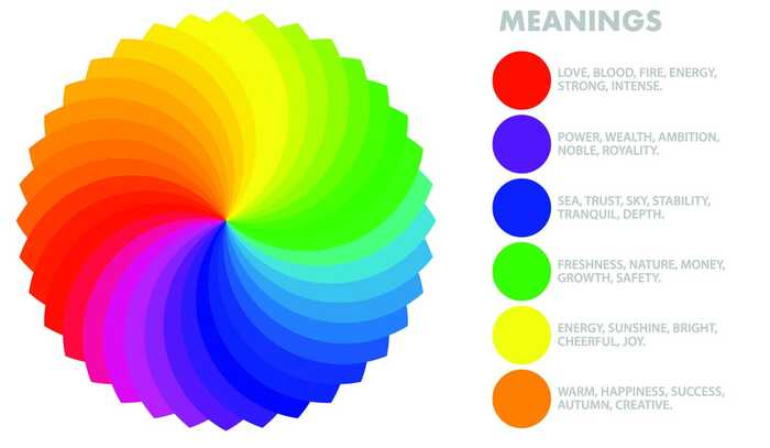
Different colours mean different things to different people, but there are various associations which most people feel to certain colours. The meanings shown above are just a few examples of what certain colours 'mean'. You need to think about what your customers might associate with the colours you want to use.
When choosing the colours for your website, your logo or anything to do with your brand it's a good idea to consider some colour meanings to help you on your way. You would not use red, for example, when you're working with a product that has a calm, relaxing ethos.
It's also important to think about the colours people will expect to see, like some green in a logo for a gardener. It may seem cliche, but if there's a really clear colour association and you ignore it you may end up losing people's attention to competitors who use the colours people are expecting to see. Using the appropriate colours can reassure people you are what they are looking for.
For some this is an exciting chance to put together a palette that will resonate with their customers. If that's you then read on. If you're dreading this process then skip to the end.
Your Palette Choices
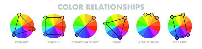
Now you have had a think about what colour you should really focus on, it's time to think about the others. Above are the different ways you can select the other colours for your palette, the analogous scheme often makes a strong choice and keeps the overall feel quite simple and coordinated. The primary or triad will give you an opportunity to really highlight some things using strong colours, but can easily look messy if you don't know what you're doing.
We use complementary colours for the Sonder brand, with a variety of monochrome colours to expand the palette. Now you've selected the colours of the rainbow you'd like to use, it's time to refine that idea further.
Green Isn't Just Green
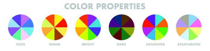
If you're a gardener, just because you should really include some sort of green in your brand palette doesn't mean that you're going to be just like everyone else. The above shows just a few ways to make your chosen colours really your own. Bright colours suit anything to do with children, a desaturated colour will work for anything calm. Men are often reported to prefer bright colours and women to generally prefer soft colours. A programme like photoshop can really help you to play with your options and come up with something you're happy with.
You can play around with tints (any colour with white added) and shades (and colour with black added). Tints can be quite soft and youthful, shades can add power and mystery. The choices you make here often depend on the colours you have chosen, as different colour properties work better with different colours. Desaturated reds aren't very popular, but blue is a very good colour for almost all property adjustments.
Can't Decide?
Luckily we live in a world where the internet can sort this out for you. If you can't work out colours, you're struggling to decide or just don't have the time, here are some tools that can help you:
- Adobe Colour - This one's a lot of fun too, you can move the points on the colour wheel and then fine tune your selections below on colour scales.
- Design Shack - Check out what's working for other websites. This one is just a blog, not an exciting tool, but it's got information about what works for other people so it's a good place for inspiration.
- Coolors Trending Palettes - This page has a huge variety of palettes that other people have liked, so you can see what's popular and use the filter at the top to select the colour that best works for your brand as a starting point for your search.
- Coolors Generator - If you've got a bit of time and want something that's just for you then try out the colour generator, beware this ones a bit too much fun and kind of addictive.
Need A Hand?
As always, we're here to help. We can create a colour palette for your brand and redesign your logo too if you like. Here's some examples of our previous logo work, if you're tempted by a little rebrand.
We can work with you to come up with a colour selection that will suit the kind of website that you're looking to build. We'll make sure you've got a good colour for the background, the CTAs and the navigation at the top.
We love building websites and making them all unique. A great colour scheme can have a big impact on the engagement of your customers so it's important to get it right.
If you'd like us to look at your colours for you then just get in touch.

Other Relevant Resources
There's always more to learn, we recommend these blogs:


Posted on June 29th 2020